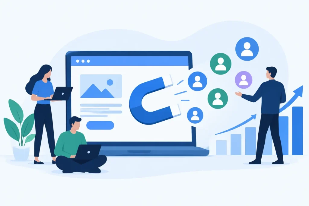

A website can rank, load, and look credible yet still fail the commercial test: it does not generate enough qualified inquiries, sales, or booked calls. Knowing how to improve website conversions starts with treating every page as part of a revenue system, not a standalone piece of design. The goal is not to get more clicks at any cost. It is to help the right visitor understand the offer, trust the business, and take the next logical step.
For founders and marketing teams, conversion rate optimization is often where fragmented digital work becomes expensive. SEO brings traffic. Paid campaigns create demand. Content answers questions. But if the website is vague, slow, or difficult to use, that investment leaks out through the bottom of the funnel. Fixing the leak can produce meaningful growth before you spend another dollar to acquire visitors.
Start With the Conversion You Actually Need
“More conversions” is too broad to manage. A local service business may need qualified estimate requests. A B2B software company may prioritize demo bookings from decision-makers. An ecommerce brand may focus on completed purchases, repeat orders, and average order value. These actions require different page structures, messages, and levels of proof.
Define one primary conversion for each key page, then identify the supporting actions that show intent. A visitor who downloads a buying guide, uses a pricing calculator, or starts a checkout may not be a customer yet, but those actions reveal where momentum is building or breaking.
This also prevents a common mistake: putting five competing calls to action above the fold. When every action appears equally important, the visitor has to decide what matters. Strong pages make that decision easier. A service page might lead with “Request a proposal,” while a product page should make “Add to cart” the obvious next move.
Build the Message Before You Change the Design
Many conversion problems are positioning problems in disguise. A polished layout cannot compensate for a headline that makes visitors work to understand what you do, who it is for, and why they should care.
Your opening section should answer three questions quickly: What outcome do you help create? Who is the offer designed for? Why should a buyer choose your approach over the alternatives? Specificity wins here. “We help manufacturers reduce unplanned downtime” is more useful than “Innovative solutions for modern industry.”
Then support the promise with practical detail. Explain the process, scope, timeline, constraints, and expected result. Buyers do not need every operational detail immediately, but they do need enough information to judge fit. Hiding all substance behind a contact form creates friction, especially for high-consideration services.
Credibility should appear where doubt appears. Add relevant case results near claims about performance. Put testimonials beside pricing or inquiry sections. Explain certifications, guarantees, implementation experience, or industry expertise before asking visitors to commit. Generic praise such as “great team” is weaker than proof tied to a commercial outcome.
Remove Friction From High-Intent Paths
Conversion rate gains often come from removing small obstacles that teams have learned to ignore. Slow mobile pages, intrusive popups, hard-to-read forms, unclear shipping details, and broken tracking all reduce confidence at the moment a visitor is deciding whether to act.
Review the path from landing page to conversion on both desktop and mobile. Do not assess it as someone who knows the business already. Assess it as a first-time buyer with limited patience. Can they find the offer, see the price or next step, understand what happens after submitting, and complete the action without unnecessary typing?
Forms deserve particular attention. Ask only for information needed to qualify or follow up. For many lead-generation pages, name, work email, company, and a short project field are enough. Longer forms can improve lead quality in some cases, particularly for complex projects, but only when the added questions clearly earn their place.
For ecommerce, the equivalent friction points are product information, shipping costs, delivery timing, returns, payment options, and checkout complexity. Do not force account creation before purchase unless there is a strong commercial reason. Convenience usually beats data collection at the point of sale.
Improve Website Conversions With Better Page Speed
Page speed is not a technical vanity metric. It affects whether visitors stay long enough to evaluate the offer, particularly on mobile connections and paid landing pages. It also shapes trust. A slow, jumping, or error-prone site suggests operational risk, even when the brand is legitimate.
Start with the pages that receive the most traffic or sit closest to revenue: homepage, core service pages, category pages, product pages, and campaign landing pages. Large uncompressed images, excess scripts, poor hosting, outdated plugins, and heavy page builders can all create unnecessary delay.
The answer is not to strip every visual element from the site. Premium brands may need rich imagery, interactive tools, or video to sell effectively. The trade-off is to use those assets intentionally, compress and defer them where possible, and measure their impact on real user behavior. A fast but generic page may convert worse than a slightly heavier page that makes the value proposition clear. The right standard is efficient performance without sacrificing the sales argument.
Use Analytics to Find the Actual Leak
Opinions about websites are cheap. Behavior data is more useful. Track primary conversions accurately, then connect them to traffic source, device, landing page, and user journey. If reporting cannot distinguish an organic lead from a paid social lead, or a completed purchase from a checkout start, optimization will be guided by assumptions.
Look for patterns rather than isolated numbers. A high-exit service page may signal weak messaging, mismatched search intent, or a missing next step. A mobile conversion rate far below desktop may point to usability or speed issues. High form starts with low submissions often means the form is too demanding, broken, or poorly explained.
Session recordings, heat maps, on-site surveys, sales-call feedback, and customer support questions add context to the numbers. Analytics may show that visitors abandon a pricing page. Qualitative feedback can reveal why: the price lacks scope, the comparison is unclear, or buyers need proof before they can justify the investment internally.
Test One Meaningful Hypothesis at a Time
Testing works best when it is connected to a specific problem. “Let’s try a different button color” is rarely a growth strategy. “Visitors reach the service page but do not request consultations because the offer and outcomes are unclear” is a testable hypothesis.
Change the element most likely to affect the decision. That may be the headline, offer structure, proof placement, form length, product imagery, pricing explanation, or call to action. Keep enough traffic and time in the test to avoid reacting to noise. On lower-traffic B2B sites, qualitative evidence and sequential improvements may be more practical than formal A/B tests that take months to reach confidence.
Not every winning test should be rolled out everywhere. A direct response landing page can be more aggressive than a homepage built for multiple audiences. Context matters. The best conversion experience aligns with visitor intent, channel, and stage of consideration.
Make Optimization an Ongoing Operating System
A website launch is a starting point, not a finish line. Search rankings shift, competitors change their offers, customer objections evolve, and new traffic sources create different user expectations. The pages that converted well last year can become underperformers without obvious warning.
Create a monthly rhythm: review performance, identify the biggest opportunity, prioritize a focused set of improvements, deploy changes, and measure the result. This is how website work begins to compound. Better technical performance supports visibility. Better content attracts more qualified visitors. Better conversion paths turn that attention into pipeline and revenue.
3Q Studio approaches the website as that connected growth system, where SEO, content, analytics, technical support, and conversion optimization inform each other instead of operating as separate projects.
The most useful next step is simple: choose one high-value page, define the conversion it should produce, and watch real users try to complete it. The gap between what you intended and what they experience will usually show you where the next gain is waiting.