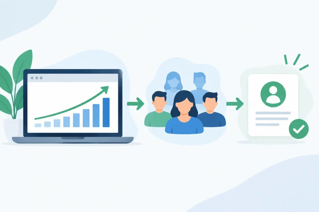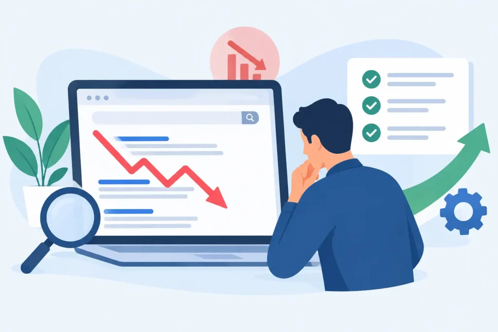

A website can attract thousands of visitors and still fail as a growth asset. The gap is rarely just traffic. It is the distance between what a visitor needs, what the page communicates, and what it asks them to do next. If you are asking how to improve website conversion rate, start by treating the site as a sales system, not a digital brochure.
A higher conversion rate does not come from changing a button color at random or adding more pop-ups. It comes from reducing uncertainty, making the value of your offer unmistakable, and removing friction from the path to action. For service businesses, that action may be a qualified inquiry or booked consultation. For ecommerce brands, it may be a completed purchase, a cart recovery, or a first order. The method changes by business model, but the operating principle stays the same: attract the right visitor, give them a clear reason to act, and make acting easy.
Start With Conversion Data, Not Opinions
Before changing pages, define what a conversion means for your business. A contact-form submission is not automatically a qualified lead. A sale is valuable, but so might be an email signup that consistently produces customers over time. Track primary conversions tied directly to revenue and supporting conversions that show intent.
Then look at performance by channel, device, landing page, and audience. A site-wide conversion rate can hide the real problem. Paid visitors may convert well while organic visitors land on educational content with no logical next step. Mobile traffic may be strong, but forms may be difficult to complete on smaller screens. One core service page may be producing most leads while another receives traffic and generates nothing.
This is where analytics becomes a management tool rather than a reporting obligation. Review where users enter, which pages they view next, where they leave, and whether their behavior differs by source. Heatmaps and session recordings can add useful context, but they should support the numbers, not replace them. A recording that shows someone rage-clicking a field is useful. A pattern across hundreds of sessions is actionable.
Make the Offer Clear Above the Fold
Most visitors make an initial judgment in seconds. They need to understand what you do, who it is for, and why your approach is worth considering before they scroll or click away.
A homepage headline such as “We build better digital experiences” may sound polished, but it does not help a founder evaluate the commercial outcome. Compare it with a direct positioning statement: “SEO-focused websites built to generate qualified leads and compound organic growth.” The second version gives the visitor a reason to keep reading because it connects the service to a business result.
Your opening message should answer three questions quickly: What result can the customer expect? Who is the offer designed for? What should they do next? Supporting copy can explain the mechanism, whether that is technical SEO, conversion optimization, content, automation, or ongoing growth support.
Avoid trying to present every service, audience, and differentiator in the first screen. A broad offer often creates vague messaging. Lead with the highest-value problem you solve, then give visitors clear routes to the services or solutions relevant to them.
Match the Page to Search Intent
Conversion rates suffer when the landing page does not match the reason someone arrived. A visitor searching for WordPress development should not land on a generic agency page with a long list of unrelated services. A user researching ecommerce SEO may not be ready for a hard sales message, but they should see relevant expertise, proof, and a logical next action.
Build pages around real intent. Service pages should make a commercial case for the service. Educational pages should answer the question thoroughly, then guide readers toward the next relevant step. Campaign landing pages should stay focused on one offer and one primary conversion goal.
Reduce Friction in the Path to Action
Every unnecessary decision lowers the chance that a visitor will convert. Navigation with too many competing options, long forms, unclear pricing signals, slow pages, and vague calls to action all introduce hesitation.
Start with the primary call to action. “Get started” can work when the next step is already obvious. In many cases, a more specific call to action performs better because it sets expectations. “Request a growth plan,” “Book a website audit,” or “Get a project estimate” tells visitors what happens after the click.
Forms deserve the same scrutiny as sales conversations. Ask only for information your team will use at that stage. If a visitor is requesting an initial consultation, requiring budget, company size, project timeline, phone number, and a detailed project brief may reduce submissions unnecessarily. On the other hand, a business that receives a high volume of poor-fit leads may benefit from a few qualifying fields. The right balance depends on lead quality, sales capacity, and deal value.
Site speed is also conversion work. A slow site creates a poor first impression and weakens performance across SEO, paid acquisition, and user experience. Compress and correctly size media, remove unnecessary scripts, improve page delivery, and test key templates on real mobile devices. A visually impressive page is not effective if its main content appears late or interactions feel delayed.
Build Credibility Before Asking for Commitment
People rarely convert because a company says it is expert. They convert when the page provides enough evidence to make the decision feel safer.
Use proof that relates to the decision at hand. A service page can show process clarity, relevant outcomes, case-study results, client testimonials, certifications, and examples of work. Ecommerce product pages may need detailed specifications, delivery and return information, reviews, comparison guidance, and answers to common objections.
Specificity carries more weight than general claims. “Improved organic traffic by 142%” is stronger than “delivered great SEO results,” provided the result is accurate and the context is clear. The same principle applies to operational proof. A business with 250+ delivered projects, a 98% client retention rate, and more than 10 years of experience can communicate maturity without relying on vague superlatives.
Do not bury trust signals at the bottom of the page. Place them near moments of decision: beside a contact form, below a pricing explanation, or alongside a call to action. The goal is not to overload the page with badges. It is to answer the reasonable question in the visitor’s mind: “Why should I trust this company with my money, time, or data?”
Create Pages That Support Real Buying Decisions
A conversion-focused page must do more than look clean. It needs to move a visitor from interest to confidence. That usually means addressing the questions your sales team hears every week: What is included? How does the process work? What does it cost? How long will it take? Is this right for a company like mine?
Pricing requires judgment. Publishing a fixed price can qualify visitors quickly and reduce sales friction when the offer is standardized. For custom website builds or ongoing growth programs, a starting range or transparent explanation of pricing drivers may be more useful. Hiding all commercial context can increase inquiries, but it can also create more unqualified conversations. Optimize for revenue quality, not just lead volume.
For complex services, show a clear delivery path. Explain what happens in discovery, strategy, implementation, launch, measurement, and ongoing optimization. This makes an intangible service easier to buy because the visitor can see how risk is managed and progress is measured.
Improve Website Conversion Rate With a Testing System
The strongest conversion gains come from a consistent testing process. Random redesigns are expensive, difficult to measure, and often driven by internal preference. A disciplined program starts with a hypothesis tied to evidence.
For example, if visitors reach a service page but rarely submit the form, the problem could be weak message match, insufficient proof, an unclear offer, or an overly demanding form. Create a test that isolates one likely issue. Test a stronger value proposition, add an outcome-based case study near the form, simplify the required fields, or change the call to action to better explain the next step.
Prioritize tests by expected business impact, traffic volume, implementation effort, and confidence in the insight. High-traffic pages with clear drop-off patterns deserve attention first. Low-traffic pages can still be improved, but they may not produce reliable test results quickly. In those cases, qualitative research and established UX principles are often more practical than waiting months for statistical certainty.
Track downstream quality as well. If a shorter form increases submissions by 30% but produces fewer sales-qualified leads, the apparent conversion win may be a commercial loss. Connect website data to CRM outcomes wherever possible so you can see which sources, pages, and user journeys generate revenue.
Treat Conversion Optimization as Ongoing Growth Work
Markets change, search behavior changes, competitors change, and your customers’ expectations change. A website that converted well two years ago can become a bottleneck even if it still looks modern. New traffic sources may bring different audiences. A change in your offer can make old pages inaccurate. Technical updates and content expansion can create new opportunities or new friction.
That is why conversion optimization works best as part of a managed growth system. SEO brings qualified demand. Content builds relevance and authority. Technical performance protects visibility and user experience. Analytics reveals where performance is leaking. CRO turns those insights into better journeys, stronger lead quality, and more revenue from the traffic you already earn.
At 3Q Studio, this is the difference between launching a site and building an asset that can attract, convert, and scale. The work does not end when the site goes live. It compounds through measured improvements.
The next useful move is simple: choose one high-intent page, identify its primary conversion, and review every element that stands between a qualified visitor and that action. Clear one obstacle, measure the result, and keep building from there.